FREE DOMESTIC SHIPPING ON ORDERS $99+ | 100% SATISFACTION GUARANTEED
FREE DOMESTIC SHIPPING ON ORDERS $99+ | 100% SATISFACTION GUARANTEED
A column with no settings can be used as a spacer
Link to your collections, sales and even external links
Add up to five columns
A column with no settings can be used as a spacer
Link to your collections, sales and even external links
Add up to five columns
Add description, images, menus and links to your mega menu
A column with no settings can be used as a spacer
Link to your collections, sales and even external links
Add up to five columns
Add description, images, menus and links to your mega menu
A column with no settings can be used as a spacer
Link to your collections, sales and even external links
Add up to five columns
Add description, images, menus and links to your mega menu
A column with no settings can be used as a spacer
Link to your collections, sales and even external links
Add up to five columns
Add description, images, menus and links to your mega menu
A column with no settings can be used as a spacer
Link to your collections, sales and even external links
Add up to five columns
10 invitations that totally rocked our wedding socks
September 14, 2016 4 min read
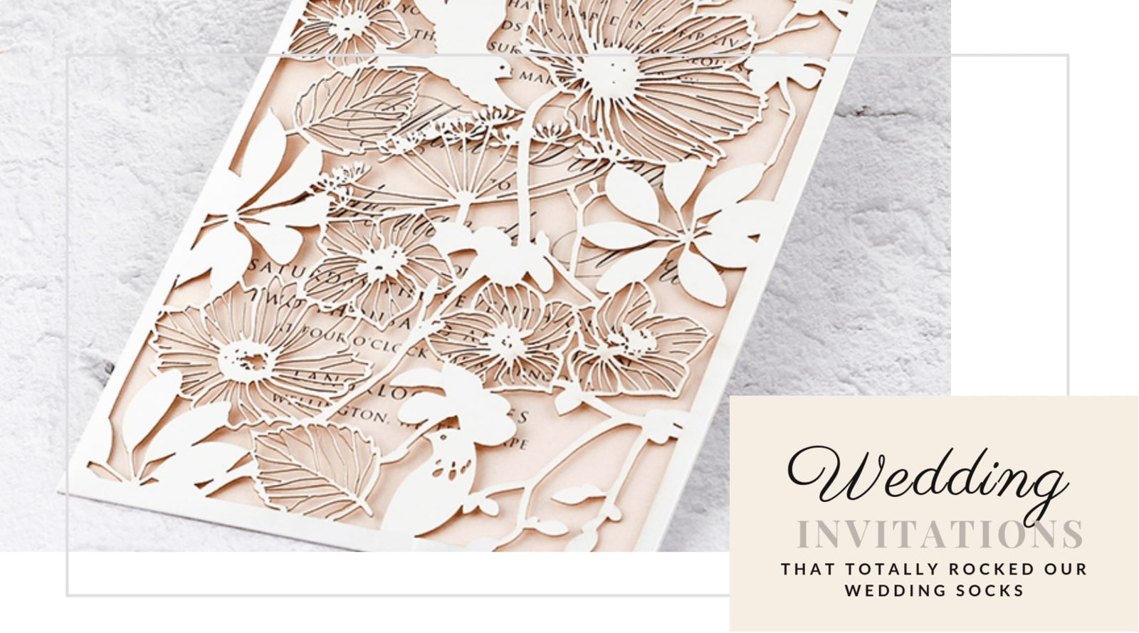
Take a look at our stunning wedding invitation inspiration
It wasn’t easy choosing just ten invitations that I loved. To be fair, I loved them all and there is a mountain of wedding invitation inspiration out there. I’m positive I’ll be doing a post like this very soon again to cover more ground and different styles of wedding invitations. So, let’s kick off this article by saying there are so many incredibly talented artists and I respect each and every one for their amazing talents.

Secret Diary - Chloe

Credits: Secret Diary - Chloe Pocket Invitation
These lovely invitations are not elaborate but they aren’t lacking in gorgeous design details either. The lovely color choice for the watercolor illustration gives the cards a natural feel which is further reflected by the use of the brown card as well as the rope string.
Secret Diary - Isla

Credits: Secret Diary – Isla pocket Invitation Blush
The Isla Pocket invitation from Secret Diary is absolutely spectacular and the combination of soft pink, white, and light grey is amazing. The intricate laser cut design is the life of this invitation which actually uses a minimalist design for the details. There’s so much depth to this gorgeous wedding invitation, I know I would certainly enjoy receiving one of these in the mail.
4lovepolkadots - Botanical

Credits: 4Lovepolkadots - Botanical
I’m a very big fan of the blush pink and grey combination and although the color used for these invitations are a little more orange than pink, they still make me think of that gorgeous combination. This set is simple, straightforward and the use of that stunning floral illustration really adds the right touch to the invitations. 4lovepolkadots makes use of various floral elements quite often in their designs and I love it!
Bright Room Studio – Vibrant Watercolor (Katie and Bryan)


Credits: Designer - Bright Room Studio via Oh So Beautiful Paper
I’ll start by saying that I really like this font and color combination. The peach hues combined with the dark blue is unusual but it works so well and is just gorgeous. One of my favorite pieces in this set is the save the date illustrated card. Such a great idea and it looks fantastic among the rest of the invitation pieces.
4lovepolkadots - Rustic

Credit: 4lovepolkadots - Rustic
The rustic wedding theme is by far one of our most popular wedding pinterest boards and there’s no doubt why. The inspiration here is seemingly endless. This is just one of the pins I adore on that board and when I went to check out the rest of the invitation I simply fell in love. Apart from the fact that the color of the invitation design makes it easy to fit into just about any color scheme decided on for a wedding, it also has lovely elements that add character to this invitation set.
Bright Room Studio – Pink Watercolor (Taylor and Bobby)


Credits: Designer - Bright Room Studio via Oh So Beautiful Paper
The invitation set from Bright Room Studio is simply stunning. With light, floral and feminine elements, the designer used watercolor to add dimension to this set. It looks amazing and would make the perfect invitation for a spring wedding using shades of pink. I simply love the use of the watercolor wash, brush strokes and white font.
MonVoir – Vibrant muse


Credits: MonVoir – Vibrant Muse
This pretty design uses bright colors and a plain white paper stock to catch attention and is stunning beyond words. I love the use of orange, yellow, and green here. Also, the use of a loosely elegant font makes the invitation very striking. This would make a gorgeous invitation for a vibrant summer wedding and it’s definitely gone onto our wedding invitations pinterest board!
MonVoir - Minimalist


Credits: MonVoir - Minimalist
If you look past the yellow of the lemon and the beautiful design of the plate, you’ll notice that this wedding suite is gorgeously simple but definitely not lacking in character! The hand-written font in shades of the same blue adds depth to the various pieces in this sweet and the vellum pocket style envelope gives it a whole lot of dimension. I absolutely love the wax seal used as a tie design element on the vellum!
Art + Alexander - Monochromatic


Credits: Art + Alexander - Monochromatic
I love that this invitation design is both simple and incredibly rich all in one. The fine lines of the calligraphy pen used for the illustration creates a stunning depth and the color combination is utterly amazing. It’s understated yet strong, bold but not overpowering and the addition of the gold used for the wax seal is just perfect.
Riley Conaway – Riley and Jimmy

Credits: Stationery company: Papellerie, Designer: Riley Conaway , Photographer: Chelsea Davis.
Technically, this is an announcement and not an invitation but I’ve added it to the list as a beautiful design as I simply love the use of colors here. It’s definitely bright, bold, and incredibly beautiful. I simply love the bright pink elements with loose hand-written details on the invitation suite. The designer of this stunning invitation, Riley Conaway designed this as her own wedding announcement and she mentions on the Papellerie website that the flowers and paper products were at the top of her priority list. You can see that she combined these two elements very nicely.

